SESSION TASK
THE LIFE CYCLE
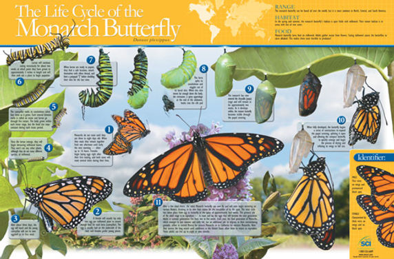
The life cycle of a butterfly-
I don't think there is much of a grid structure although there are columns in which the text boxes seem to flow in. I think the colours they have used are very fitting to the poster and butterfly as usually butterflies are bright in colour. They have kept the theme of bright colours by using a yellow colour across the top of the page and also incorporating the green leaves and colourful butterflies into it. I think the typeface they have used fits in well with the poster but I think it could have been a bit bolder which would have made it stand out more, although the type they have used for the information part is clear and easy to read and follow. I think the information flows quite well but some of the images are misleading, for example next to box number 1 there are images of butterflies flying which isn't the case. They only start putting images of cocoons by image 6 so I think they could have place the images more carefully. I think overall its a nice design and engaging to look it, it catches your eye because of the bright colours used.
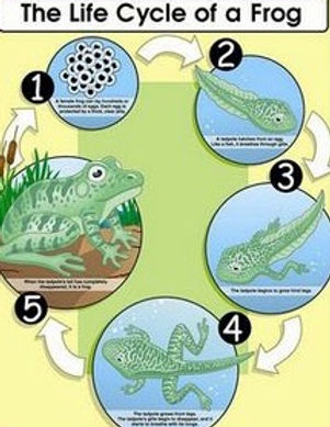
The life cycle of a frog-
There is a circular structure to the poster which makes it very easy to follow as it is clearly numbered and flows well. I think the typeface they have used is easy to read stands out quite well, I also think its well suited to children. I think the background colour fits in with the sort of nature theme and its also quite subtle which doesn't detract your eye from the main focus of the poster. I think they have made the cycle itself quite colourful and eye catching. I think the circles are quite simple but I don't think it needs any other shapes in it as it works the way it is, the circles almost represent a pond sort of shape which resembles the frogs habitat. I think the information flows really well and you can see very clearly where to start and finish reading. The arrows also make it even clearer. Overall I think it work well and I think it is easier to follow than the butterfly one.
References:
-http://www.scienceenthusiast.com/product/images/20492.jpg
-https://s-media-cache-ak0.pinimg.com/236x/fc/ee/84/fcee8484597201ded5735a4336ed6d58.jpg